概要
Matplotlibのpyplotでグラフを描き、タイトル・軸名・凡例を設定して保存する手順を整理する。
同じ観測値を散布図と折れ線で描き、点を線で結ぶ順番によって伝わる意味が変わることを確かめる。観測点の関係と時間に沿った変化を区別し、目的に合う描き方を選ぶ。比較図はPython 3.12.2・Matplotlib 3.11.2で生成。
この記事の構成
- Matplotlibの環境準備
Matplotlibの環境準備の手順と確認ポイントを整理。 - Matplotlibの使用方法
基本描画と保存、画像表示、散布図と折れ線の使い分けを確認。
実施内容
Matplotlibの環境準備
Matplotlibは、折れ線グラフ、散布図、ヒストグラム、画像などを描画できるPythonライブラリで、NumPyと組み合わせて使用する場面も多い。
- Matplotlibのインストール
使用するPython環境を明確にするため、次のようにPython経由でpipを実行。
インストール後は$ python -m pip install matplotlibpython -c "import matplotlib; print(matplotlib.__version__)"で、読み込まれたバージョンを確認できる。以降ではmatplotlib.pyplotの基本操作に絞る。
Matplotlibの使用方法
-
区間、刻み幅、グラフタイトル、軸ラベルの設定と表示
二次関数y = x^2を例に区間、刻み幅、グラフタイトル、軸ラベルを設定してグラフを描画する。np.arange(0, 20, 0.01)は、0以上20未満の値を0.01刻みで生成。$ python >>> import numpy as np >>> import matplotlib.pyplot as plt >>> x = np.arange(0, 20, 0.01) # 0以上20未満の範囲を0.01刻みに設定 >>> y = x**2 >>> plt.title("y = x^2\n# arange:0, 20, 0.01, xlabel:x, ylabel:y") # グラフタイトルを設定 Text(0.5, 1.0, 'y = x^2\n# arange:0, 20, 0.01, xlabel:x, ylabel:y') >>> plt.xlabel("x") # x軸のラベルを設定 Text(0.5, 0, 'x') >>> plt.ylabel("y") # y軸のラベルを設定 Text(0, 0.5, 'y') >>> plt.plot(x,y) # グラフの描画 [<matplotlib.lines.Line2D object at 0x7fa0a479eb70>] >>> plt.savefig('pid13_1.png') # 任意の保存先を指定 >>> plt.close() # 図を閉じ、次の描画へ状態を持ち越さない- 上記で出力したグラフ「pid13_1.png」
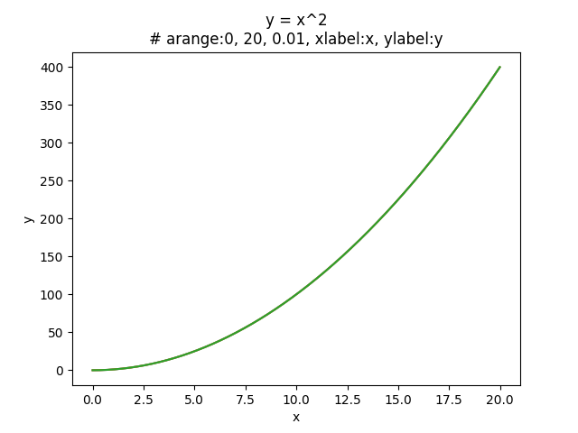
- 上記で出力したグラフ「pid13_1.png」
-
2つのグラフ、凡例の設定と表示
三角関数y = sin(x)とy = cos(x)を例に凡例の設定を行い、2つのグラフを表示。$ python >>> import numpy as np >>> import matplotlib.pyplot as plt >>> x = np.arange(0, 6, 0.01) # 0以上6未満の範囲を0.01刻みに設定 >>> plt.title("y = sin(x), y = cos(x)\n# arange:0, 6, 0.01, xlabel:x, ylabel:y, legend:sin&cos") # グラフタイトルを設定 Text(0.5, 1.0, 'y = sin(x), y = cos(x)\n# arange:0, 6, 0.01, xlabel:x, ylabel:y, legend:sin&cos') >>> plt.xlabel("x") # x軸のラベルを設定 Text(0.5, 0, 'x') >>> plt.ylabel("y") # y軸のラベルを設定 Text(0, 0.5, 'y') >>> y_sin = np.sin(x) >>> y_cos = np.cos(x) >>> plt.plot(x, y_sin, label="sin") # グラフの描画 ※実線で描画 ( デフォルト ) [<matplotlib.lines.Line2D object at 0x7fde03617fd0>] >>> plt.plot(x, y_cos, linestyle="--", label="cos") # グラフの描画 ※破線で描画 [<matplotlib.lines.Line2D object at 0x7fde03625048>] >>> plt.legend() # 凡例の描画 <matplotlib.legend.Legend object at 0x7fde03625358> >>> plt.savefig('pid13_2.png') # 任意の保存先を指定 >>> plt.close()- 上記で出力したグラフ「pid13_2.png」
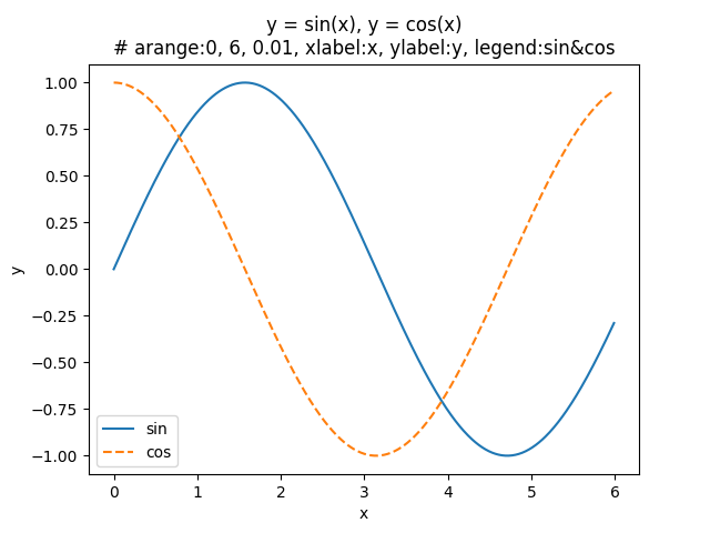
- 上記で出力したグラフ「pid13_2.png」
-
imreadを使った画像表示
matplotlib.imageのimreadによって画像をNumPy配列として読み込み、pyplot.imshowで座標軸上に表示。
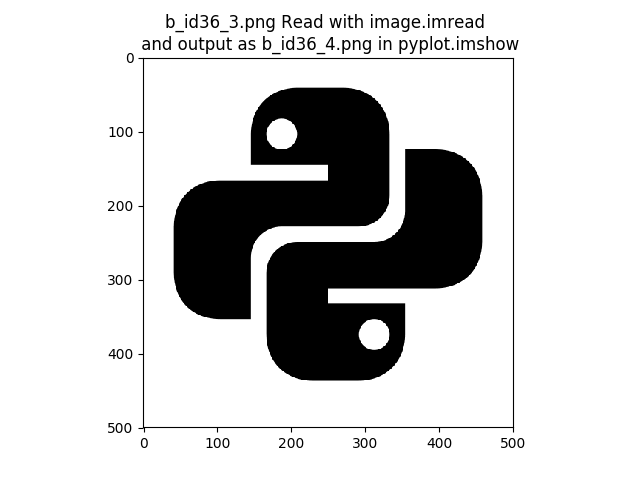
ここでは、透過背景のPythonロゴ画像「pid13_3.png」を読み込み、描画結果を「pid13_4.png」として保存。
読み込んだ配列のshapeを確認すると、画像の高さ、幅、色チャンネル数も確認できる。-
読み込み元の画像「pid13_3.png」

-
「pid13_3.png」を
imreadで読み込み、imshowで表示して「pid13_4.png」として保存$ python >>> import matplotlib.pyplot as plt >>> from matplotlib.image import imread >>> img = imread('pid13_3.png') # Pythonロゴ画像を読み込み >>> img.shape (500, 500, 4) >>> plt.imshow(img) # 画像表示 <matplotlib.image.AxesImage object at 0x7f4b80106f60> >>> plt.title('pid13_3.png Read with image.imread \n and output as pid13_4.png in pyplot.imshow') >>> plt.savefig('pid13_4.png') >>> plt.close() -
上記で出力した画像「pid13_4.png」
shapeの値や保存画像の余白は、元画像やMatplotlibのバージョン・設定によって異なる。 -
-
同じ観測値を散布図と折れ線で比べる
時刻と気温の組が(0分, 20°C)、(20分, 23°C)、(10分, 21°C)、(30分, 22°C)の順に届いたとする。説明用の観測値であり、入力の並びは時刻順ではない。import matplotlib.pyplot as plt minutes = [0, 20, 10, 30] temperatures = [20, 23, 21, 22] ordered = sorted(zip(minutes, temperatures)) ordered_minutes, ordered_temperatures = zip(*ordered) with plt.rc_context({"font.size": 16}): fig, axes = plt.subplots(3, 1, figsize=(6, 10), sharex=True, sharey=True, layout="constrained") axes[0].scatter(minutes, temperatures, s=70) axes[0].set_title("Scatter") axes[1].plot(minutes, temperatures, "o--") axes[1].set_title("Line: input order") axes[2].plot(ordered_minutes, ordered_temperatures, "o-") axes[2].set_title("Line: time order") for ax in axes: ax.set_ylabel("Temperature [°C]") ax.set_xlim(-2, 32) ax.set_ylim(19, 24) ax.grid(alpha=0.3) axes[2].set_xlabel("Time [min]") fig.savefig("pid13_5.png", dpi=120) plt.close(fig)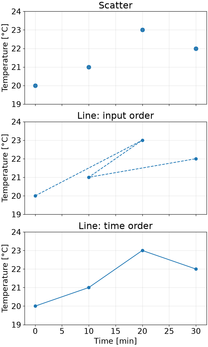
上段の散布図は4つの観測点を線で結ばずに示す。
中段の折れ線は渡した順番の0分→20分→10分→30分を結ぶため、時間が戻る線ができる。
plot()が時刻順へ自動で並べ替えるわけではない。下段では時刻と気温を
zip()で組にしてから並べ替えた。
時刻だけを並べ替えると気温との対応が壊れるため、組のまま順序を変える。
時間変化を伝えたい場合はこちらの並びを使う。ただし観測点の間を結んだ線は未観測時刻の実測値ではない。散布図は観測点の位置関係、折れ線は意味のある順序に沿った変化を示す場合に選ぶ。
移動経路など入力順そのものに意味があるデータでは、xの値で並べ替えることが適切とは限らない。
軸の意味と結ぶ順序を決めてから描画する。分布を見たい場合は
plt.hist()によるヒストグラムも選択肢になる。
グラフの種類にかかわらず軸名・単位・必要な凡例を付け、画像だけでも対象を読み取れるようにする。
まとめ
- 散布図は観測点の位置関係、折れ線は意味のある順序に沿った変化を示す場合に使う。
- plot()は渡した順に点を結ぶ。時刻順へ並べ替える場合は観測値との組を保ち、点の間の線を実測値と混同しない。
- 軸名・単位・凡例を付け、画面表示にはshow()、画像保存にはsavefig()を使う。保存後はclose()で図を閉じる。
- imread()で読み込んだ画像はNumPy配列として扱い、imshow()で表示できる。
参考文献
- 斎藤 康毅(\(2016\))『ゼロから作るDeep Learning ―Pythonで学ぶディープラーニングの理論と実装』株式会社オライリー・ジャパン
- Matplotlib, Getting started(英語・公式導入手順)
- Matplotlib, Pyplot tutorial(英語・グラフ描画の公式入門)
- Matplotlib, Image tutorial(英語・画像表示の公式解説)